


When I walk through a museum or flip through a glossy design magazine, I can admire one color combination and then 2 minutes later, be smitten by something completely different. There is such a richness and diversity in color combinations, I don't know if I can say I have a favorite or a preference for one combination over another. However, I have noticed some patterns:
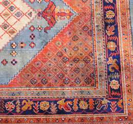
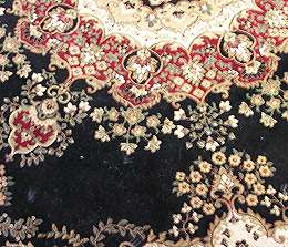
My home is all modern taupe neutral, since it's a showcase for my Asian art, and I use these strong rich color combinations as accents, one for public spaces and one for private spaces. Can you guess which is which?:
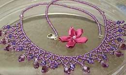
But my jewelry designs are all light and airy and seem to have a lot of either pastels or delicate color choices. Weird, huh! Wonder what would happen if I thought about home decor while I was designing wearables?


2 comments:
Wow....that purple necklace is beautiful. So intricate. Like you, I tend to gravitate to the soft pastel colors. I told myself that next year I am going to start broadening my horizens with some different color choices. Have a great weekend! Karin
the red and blue is your private carpet? I like that one, very colorful.
Thoses pink and white earings are gorgeous, almost like little flower buds.
Post a Comment